Custom Block Demo & Content Guide
Introduction
Hexagon is built in a modular fashion to Beekeeper’s account staff maximum flexibility, independence and control without requiring the development team to be heavily engaged. To achieve that modularity, the Beekeeper team leveraged WordPress’ Gutenberg editor, which allows site administrators to build pages from a combination of “blocks” that display content in a variety of formats.
Gutenberg comes with some blocks built in, and instructions on the basics of using Gutenberg and WordPress are available through a series of short videos in the WordPress admin here: https://protectinterchange.com/wp-admin/admin.php?page=wp101#wp101-the-dashboard.
This page provides two sets of instructions:
- How to create a new page from Beekeeper’s pre-built templates.
- How to use each of the blocks built and customized for the VELA team, along with examples of those blocks.
All blocks are available for the site’s pages, and most are available for the site’s posts, as well, providing the ability to implement new layout elements as appropriate over time into both templates.
A note about mobile: Most blocks should be setup to stack on mobile as we normally default to doing. When you select a block, you’ll get this “Visibility” option in the sidebar: https://www.dropbox.com/s/y3oyz7b5czolrae/Screen%20Shot%202021-04-16%20at%201.32.53%20PM.png?dl=0. Use that to control for what should and shouldn’t appear on mobile.
Creating a New Page
Traditionally, when using the “Classic” editor (as opposed to Gutenberg), users create a new, blank page by going to the WordPress Dashboard, selecting “Pages” and clicking and “Add New” button.
In Gutenberg, this will also create a new, blank page, but most likely the desired behavior is to create a page with the appropriate Gutenberg blocks already populated.
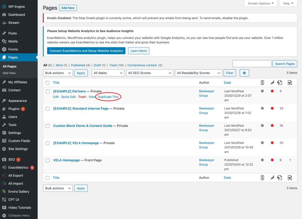
The VELA site contains three page examples, with blocks populated for exactly this purpose: a homepage, a Partners page and a Standard Inner Page.
To create a new page from any of these examples, simply navigation to “Pages” in the WordPress dashboard, identify the desired example to start with, and hover over it. A “Duplicate This” button will appear, allowing the admin to create a new, blank page with blocks already populated.
Creating A New Post
To create a new post, in the Dashboard, go to Posts–>Add New.
After entering your content, you need to make two choices:
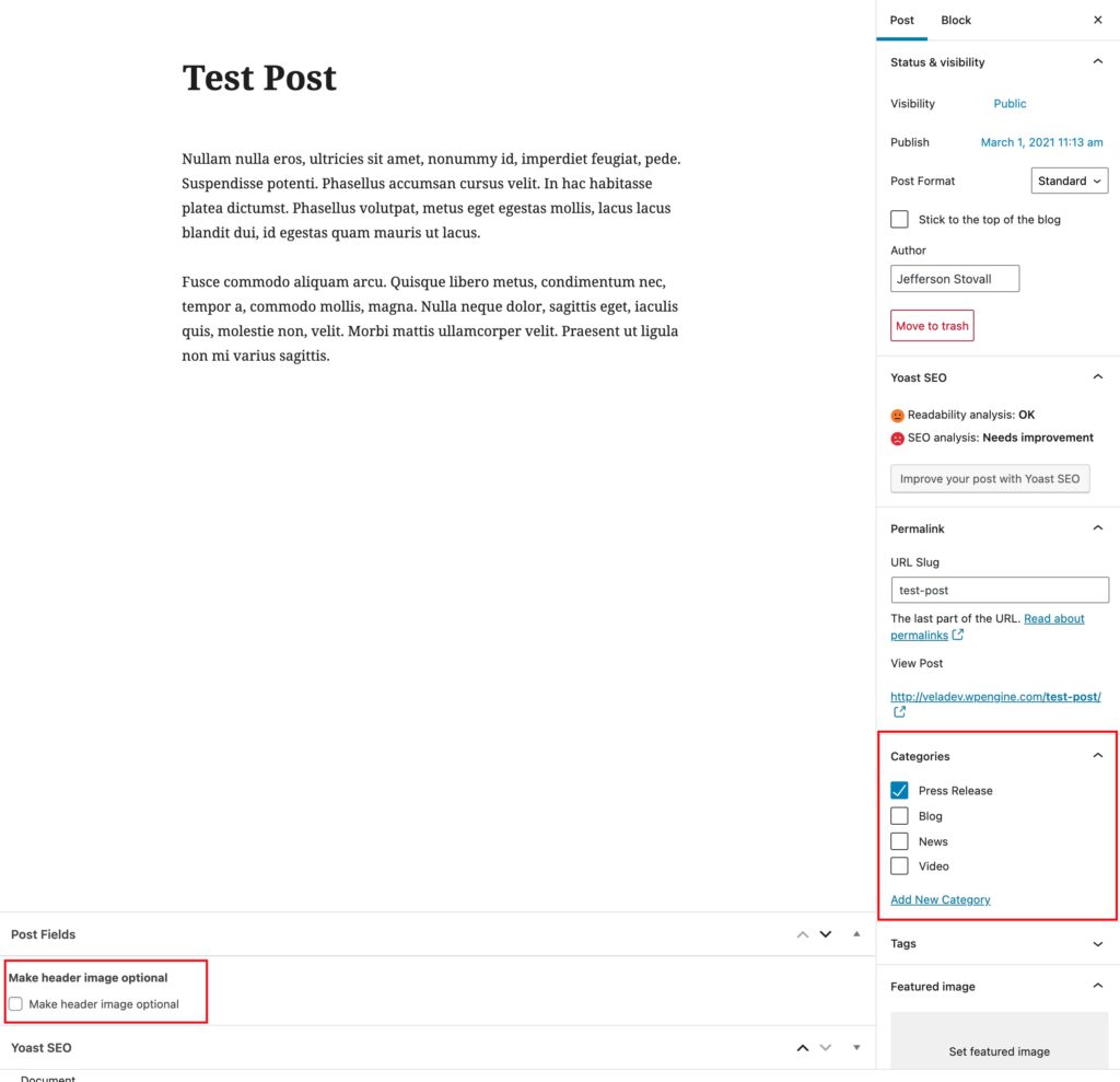
- Determine which category the post should go into: Press Release, Blog, News or Video. This will determine how the post is styled.
- Determine if you want to use a header image with the post. Note that all posts must have a featured image in order to properly display on the homepage (and any related content sections across the site), but the admin can turn off the header image on individual posts.
Finally, the posts editor uses the Gutenberg block approach, as well, so admins are able to add any of the blocks below if desired. We recommend discretion with this ability.
Hero Section
The hero section is use at the top important pages to communicate to the user the page title and possibly direct them to content on or off the page.
- Hero Type: Choose between a static image or a video. If choosing video, you can set a static placeholder image. An image or video is required to use this block.
- Background Overlay Color: This sets the color of the overlay for the image or video.
- Hero Title/Description: These fields allow you to set the content that will display on the front end.
- Hero Button: If a link is selected, this will display a button on the front. If a link is not selected, it will not display at all.
- Button Style: To accommodate different possible backgrounds, you can chose between a dark and light button style.
- Display Button as Caret: This option allows the admin to determine whether the button appears as a caret, useful for helping users to understand there is additional valuable content farther down the page, or a regular button.
Hero Title
Hero Description Text
Nunc egestas, augue at pellentesque laoreet, felis eros vehicula leo, at malesuada velit leo quis pede. Ut varius tincidunt libero. Fusce convallis metus id felis luctus adipiscing. Cras varius. Ut non enim eleifend felis pretium feugiat.
About Section
The About Section block is similar to the mission statement block, but defaults to using smaller text and formatting to accommodate longer content.
- Section Background Color: Select the background color for this section. It will display full color, as opposed to the hero section overlay that displays at 60%.
- About Title: Set the title for this section, that will display as an H2.
- About Hero Image: Set the hero image that will display to the left side of the section.
- Image Overlay Color: This sets the color of the overlay for the image.
- About Copy: Set the text that will display on the right side of the block. Because this is a what-you-see-is-what-you-get section, you have signifiant over the text display. Not all background color and text display permutations will work together, so be sure to preview before publishing.
- About Button: If a link is selected, this will display a button on the front. If a link is not selected, it will not display at all.
- About Button Style: To accommodate different possible backgrounds, you can chose between a dark and light button style.
- Doodle Images: If desired, select doodle images to appear at the top and bottom of the About Section. If selected, the option to hide on mobile is available.

About Title
Cras varius. Lorem ipsum dolor sit amet, consectetuer adipiscing elit. Etiam ultricies nisi vel augue. Fusce vulputate eleifend sapien. Proin faucibus arcu quis ante.
Quisque id odio. Vestibulum volutpat pretium libero. Praesent turpis. Cras sagittis. Nullam nulla eros, ultricies sit amet, nonummy id, imperdiet feugiat, pede.
Nam eget dui. Nunc nulla. Pellentesque dapibus hendrerit tortor. Quisque ut nisi. In hac habitasse platea dictumst.
Button
This block allows the admin to set a singular button on a page, independent of other blocks.
- Button: If a link is selected, this will display a button on the front end. If a link is not selected, it will not display at all.
- Button Alignment: This determines if the button will sit on the left, right or center of the content area.
- Button Style: To accommodate different possible backgrounds, you can chose between a dark and light button style.
Cards
The cards section can be used to display eye-catching or stats or social proof points.
- Doodle Image: If desired, set a doodle images to display at the top of this section. If selected, the option to hide on mobile is available.
- Cards: Add new cards by clicking “Add Row.” This content should typically be displayed in groups of three.
- Card Background Color: Select the background color for this section. It will display full color, as opposed to the hero section overlay that displays at 60%.
- Icon Image: Select an icon to display.
- Icon Image on Hover: Select an icon to display when the user hovers. This will typically only work on desktop. The icon to display on hover should be the same size as the primary icon to avoid awkward content shifts.
- Card Text: Set the explanatory content to display.
- Link: If selected, the user can visit the link by clicking anywhere on the card.
Card Section Title (H2)
An optional description for the cards section (paragraph).


Posts Carousel
This block is effectively a related content section with a tremendous amount of flexibility.
- Post Type: Choose the content type to display here. This uses WordPress’ custom post types; posts and pages will always be available and if new post types are added to the site in the future, they will be available here, as well.
- Title: Set the title for this section.
- No. of Posts to Show: Set the number of posts to show. This typically works best in multiple of three.
- Category to Show: The admin can further filter the selected post by category, as desired.
- Doodle Images: If desired, set one or more doodle images to display alongside this text. If selected, the option to hide on mobile is available.
Posts Carousel
Use this block to provide previews to posts accross the site. When published, the featured image from the selected posts will appear above the headline and excerpt in a traditional 3-across format.


Hero Section – Simple
This revised version of the hero section allows the admin to create an engaging header area on interior pages.
- Hero Image: Choose between a static image or a video. This is required to use this block.
- Background Overlay Color: This sets the color of the overlay for the image or video.
- Hero Title: This field allow you to set the content that will display on the front end.

Hero Section – Simple Title Text
Quote Section
The quote section allows the admin to insert a short amount of content into an accent area on the page
- Select Post: Determine what content will be shown.
- Author Name: This can be used for attribution or any other meta information.
- Background Color: Sets the background color for this section of the page.
- Title Color: Allows the admin to specify a different color than default text.
- Paragraph Text Color: Allows the admin to specify a different color than default text.
- Doodle Image: If desired, set one or more doodle images to display alongside this text. If selected, the option to hide on mobile is available.
Lorem ipsum dolor sit amet, consectetur adipiscing elit, sed do eiusmod tempor incididunt ut labore et dolore magna aliqua. Vel facilisis volutpat est velit egestas dui id ornare.
Related Content Section
This section differs from the post carousel in that it is optimized to work on interior pages, utilizing fewer posts and giving the admin greater control over the posts selected.
- Section Background Color: Select the background color for this section. It will display full color, as opposed to the hero section overlay that displays at 60%.
- Section Description: Set the text that will display on the front end. Because this is a what-you-see-is-what-you-get section, you have signifiant over the text display. Not all background color and text display permutations will work together, so be sure to preview before publishing.
- Doodle Images: If desired, set one or more doodle images to display alongside this text. If selected, the option to hide on mobile is available.
Related Content
Use this block to provide links to posts and pages in other parts of the site. When published, the featured image from the post or page will appear above the headline and excerpt in a traditional 3-across format.


Partner Block
The partner block gives the admin the ability to inserting large-format profile and call to action, alternating the orientation of the image and text. The image is pulled from the page’s featured image.
- Title: Set the title for this section.
- Title Doodle: If desired, set one or more doodle images to display alongside this text. If selected, the option to hide on mobile is available.
- Partner Section: Add a new partner row by using the “Add Partner” button.
- Select Partner: This field allows the admin to specify what page the link takes the user to.
- Image Overlay Color: This sets the color of the overlay for the image or video.
- Doodle: If desired, set one or more doodle images to display under this section. If selected, the option to hide on mobile is available.
Partner Block Title

Partner 01
Cras egestas mauris vitae purus pretium, at convallis velit placerat. Phasellus sollicitudin faucibus placerat. Vivamus accumsan sagittis dolor, id commodo justo luctus eget. Maecenas gravida lacus vitae molestie congue. Suspendisse enim metus, facilisis ac laoreet vel, gravida nec nisi. Sed semper nulla id cursus accumsan. Aliquam erat volutpat.

Partner 02
Cras egestas mauris vitae purus pretium, at convallis velit placerat. Phasellus sollicitudin faucibus placerat. Vivamus accumsan sagittis dolor, id commodo justo luctus eget. Maecenas gravida lacus vitae molestie congue. Suspendisse enim metus, facilisis ac laoreet vel, gravida nec nisi. Sed semper nulla id cursus accumsan. Aliquam erat volutpat.

Partner 03
Cras egestas mauris vitae purus pretium, at convallis velit placerat. Phasellus sollicitudin faucibus placerat. Vivamus accumsan sagittis dolor, id commodo justo luctus eget. Maecenas gravida lacus vitae molestie congue. Suspendisse enim metus, facilisis ac laoreet vel, gravida nec nisi. Sed semper nulla id cursus accumsan. Aliquam erat volutpat.
Callout Box
Callout boxes are a way of giving users entry points to deeper levels of content. Each box can display text on hover.
Callout Box Title
Vivamus faucibus est vel sodales convallis. Curabitur quam nisl, accumsan vel feugiat sodales, facilisis nec arcu. Sed non dolor sit amet sapien aliquam posuere. Donec pellentesque sollicitudin odio vitae tempus. Pellentesque tincidunt erat suscipit, sagittis ligula quis, cursus augue. Mauris accumsan tellus sit amet aliquam ultrices. Cras ut elementum ante. Aliquam quis auctor enim. Suspendisse potenti. Cras sodales, ex non aliquam malesuada, ante diam suscipit purus, euismod convallis justo nunc ornare ipsum. Aliquam nec malesuada arcu. Sed pulvinar est id molestie varius.


Featured Video
The featured video is meant to be displayed in-line, amongst other text and elements, as opposed to being a hero video.
Featured video title
Featured video description
Callout Stats
This block is one of the least finished, but its utility is probably obvious in a world that loves info snacking.
Callout Stats Title
10
Acorns
20
Alarm Clocks
30
Aliens
About Section – Fixed Container
Don’t worry about using this block yet.

About Section Title
lorem ipsum